The system.
This document is not a moodboard. It is the operating standard for every visual, written, and structural decision made under the Goal Velocity name. Deviate with reason. Never with vibes.
The brand exists to signal three things, in order.
Every choice in this system — every color, every line, every word — exists to project one of these three signals. If a design decision doesn't reinforce one of them, it's wrong by definition.
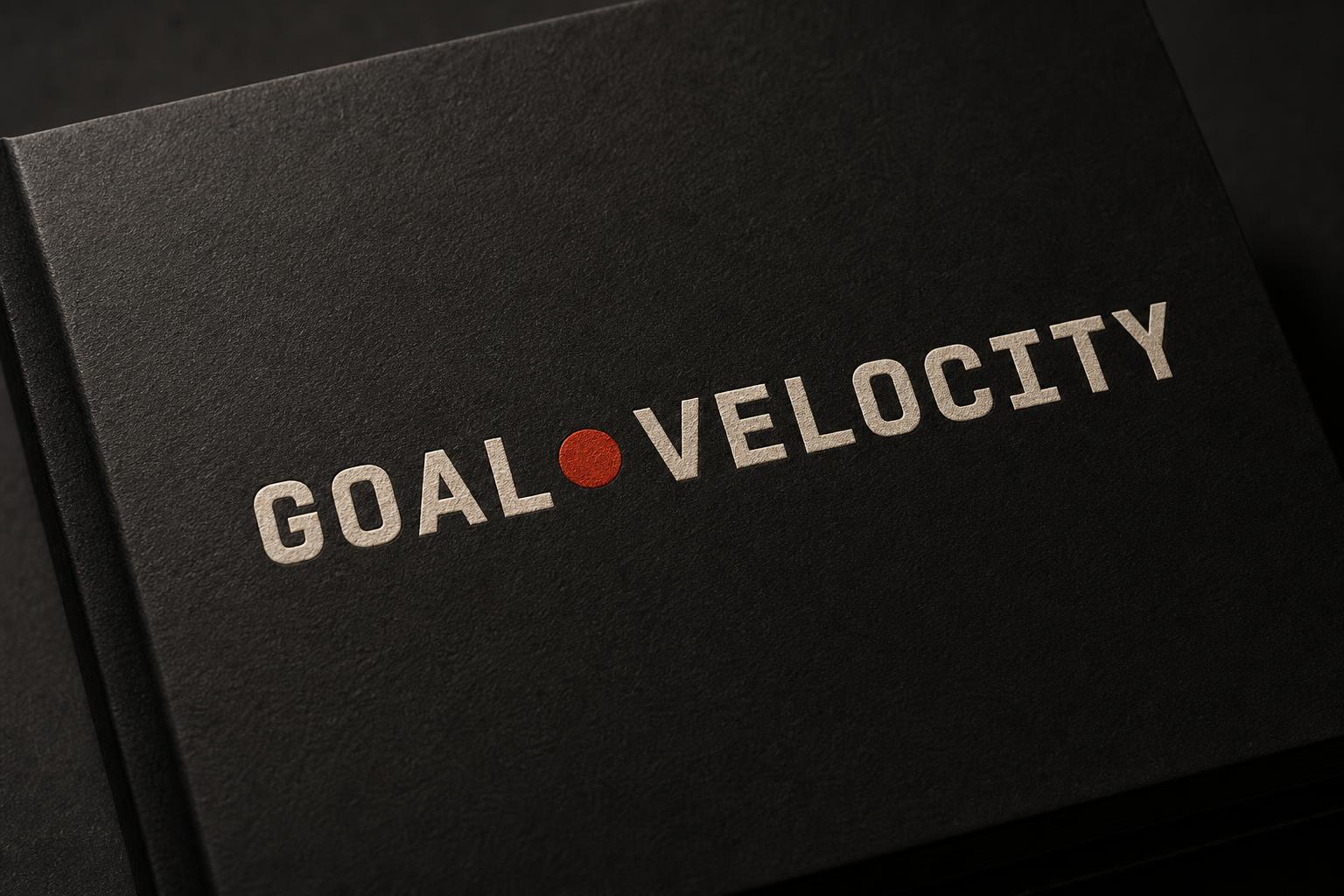
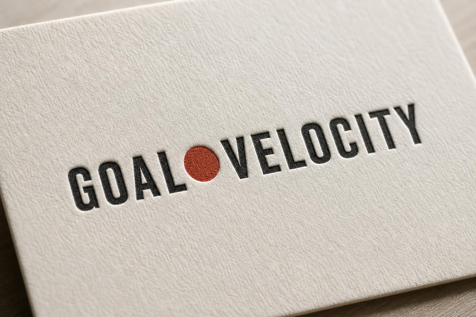
The palette is warm dark, not cold tech.
Pure black is off limits — it reads cheap and AI-coded. Every surface is warm-toned. The accent is a single signal red, used surgically. Cream is the text. Gold is reserved for prices and proof. That is the entire system.
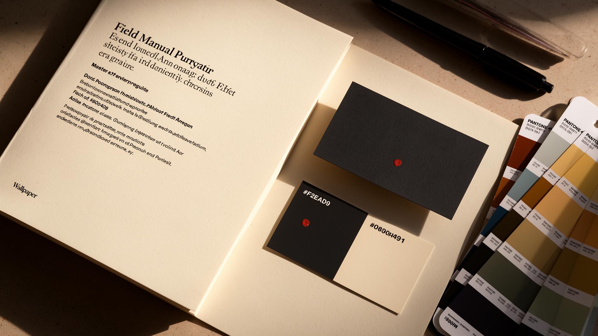
Two families. That's it.
A mono for everything that signals — headlines, labels, structure, anything uppercase. A sans for prose. No third typeface exists in this system. Anyone who wants to add one should be asked to leave. The mono carries the brand. If a moment isn't loud enough in mono, it doesn't belong on the page.
The mark is the name.
No icon. No logomark. No abstract symbol pretending to mean something. The wordmark IS the brand. It's typed in mono — because we build, we don't decorate.
Operator-direct. Anti-corporate. Never cute.
Every line is written like an operator talking to another operator at 11pm — short, specific, allergic to LinkedIn-speak. Profanity is allowed when it sharpens the point. Adjectives are taxed at 90%.
- Goals don't grow businesses. Constraints do.
- You can't outrun your opex.
- If I can't name your constraint, you don't pay.
- The audit is the deliverable, not a sales call.
- The constraint dictates the work, not the other way around.
- We empower brands to scale through innovative AI solutions.
- Our cutting-edge methodology delivers transformational outcomes.
- Leverage synergies to unlock next-gen growth.
- Let's hop on a quick discovery call to align on your journey.
- Disrupt your category with our award-winning platform.
The grid is generous.
Cramped layouts read cheap. Sections breathe at 6.5rem vertical padding minimum. Containers max out at 920px for prose, 1240px for grids. Anything wider reads like a marketing site.
Sharp edges. One border. No rounding.
Border radius is 0px everywhere except where physical reality demands otherwise (form inputs on iOS, etc.). The system has square corners. Square corners read operator. Rounded corners read SaaS.
If you ship any of this, it's wrong.
These aren't preferences. They're the visual and verbal moves that would collapse the brand into the generic AI-consulting pile. None of them are debatable.